ABOUT THE PROJECT
This project was created as part of a “design challenge” for an interview process, the reason why I cannot name the company. Their original idea was to design a “storefront” for their users (K-8 school teachers) to share with others the online lessons they are using. The main goal was to grow usage of the platform.
PROBLEM/OPPORTUNITY
This “mystery customer” has a platform that allows school teachers to use/create content that can be used by students via desktop/phone/tablet computers. They assumed creating another way(“the storefront”) to share content with others would increase the number of users of their solution. The concept of a “storefront” would be a place where the users could add their “favorite” lessons, contributing with others finding good content. Some kind of gamification could be also a nice addition to the idea, and, potentially, provide some user excitement, consequently, helping to grow the platform.
Digging into the problem, thru marketplaces research, a quick survey of top users, and a current user journey map (see below), I noticed some design opportunities in the current website to help with the growth goal – for example, the home page after the login did not offer any guidance on what to do first, users had two areas for updating profile, and, with the idea of “storefront”, they would also have two areas of content management.

Customer Journey Map
Add to that the names “storefront” and “storefront owners” were not related to the users’ skill and background, after all, they are teachers, not merchants.
DESIGN CHALLENGES
Having decided to change all website design and altering the original proposition of the design challenge, the storefront itself, for something different, I had to manage the task as a real project. I just had a couple of days to do everything but also find a way to “sell” the stakeholders my UX strategy.
ABOUT THE DESIGN PROCESS
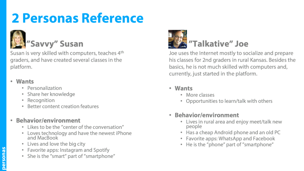
Besides the journey map, I created a simple, one-page/two-personas reference sheet to support some design decisions:
I also set a list of re-design opportunities to guarantee I would be finishing the project in its original timeframe/deadline:
- Having a new “Welcome” page that meant I am ready! replacing the current one that screamed What’s Now?
- Expose “hidden” options and eliminate redundancies – one click to access everything.
- Unify elements, combining similar topics.
- Propose something more compelling to teachers than a “storefront” but, more important, offer the mystery customer a solution for its growth needs.
DESIGN PROPOSAL/BENEFITS
My UX proposal contemplated 3 top things:
1) “ME” Dashboard: a single point for users, eliminating unnecessary steps, keeping them up to date. It becomes the main interface, personal, yet beautiful.

“ME” dashboard
2) “My Library is the Storefront”: instead of creating another area on the website, which could be confusing to the “Talkative” Joe’s, and add more work to “Savvy” Susan, this new concept keeps content in just one place. When users are ready to share, all they need to do is to click a button, setting the content as “My Picks”. Everything checked as “My Picks” is public. Also, instead of calling users “storefront owners”, they became “Mentors”, a much more appropriate title for the audience.

My Library and Picks – just click the “heart button” and the content becomes public.
3) Gamification: the more the mentor shares, he/she gets more incentives in the form of badges. They also see their performance against other users, thru a ranking system that promotes healthy competition. After all, sharing is good!

RESULTS
Although we couldn’t move forward with this opportunity, I sincerely wish the mystery customer success in its direction. Who knows if they will go with the “mentorship/simplified library” approach, or if they were already committed to the idea of another place to manage content?
Below, a quick example of how the new website could be.
