As I mentioned in my last week posting, I would like to share some experiences I had supporting a friend’s project a few months ago. I will focus only on how we worked together as a small team and I will also illustrate the way I designed the product from concept to reality. The Project Goal Create an innovative software to support dentists to pre-sale whitening treatments. It must be easy to use, not expensive, with features that excite patients to pay for a whitening treatment. The Team Besides me (interactive/interface designer), a developer (of course writing the code) and a dentist (responsible for the whitening probability matrix). After one “in person” meeting, all other interactions were done via email or phone, with live checkpoints after finishing important milestones (I will cover them later). Making things work Although it was such a small team, it is important to highlight that three different backgrounds means different approaches to present and agree in things (for example, be prepared to work in more than one way of presenting things –the developer can understand some small sketches and thumbnails, the dentist will need a high definition mockup to perceive the same information), saying that, keep in mind the advice I gave in the first posting about users not being like you:
- They do not have the same equipment you have;
- They do not have the same education/specialization you have;
- They are not interested in technical details as you do;
With the agreement of sharing info via email or instant messaging as need, the developer and I mixed the piggyback and parallel integration model. This mix is easy to implement in a small team (by the way this is one of the advantages of teams with such few members), although should be complicated to be implemented in the case of several designers and/or developers working together. After the live meeting with the dentist, the decision was to create a product targeting whitening features. With this information, the decision was to lock the basic features as:
- Create/Open Patient: allowing the creation of treatments based on new or previous patients;
- Import of pictures: to be manipulated in front of the customer;
- Matrix of whitening: a table with customer data that helps to estimate the rate of success of the treatment;
- Teeth selection: tool to select the teeth area for image manipulation;
- Pictures comparison: a list of patient pictures showing before/after results;
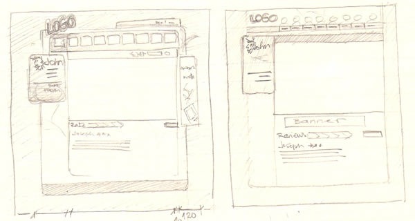
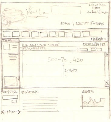
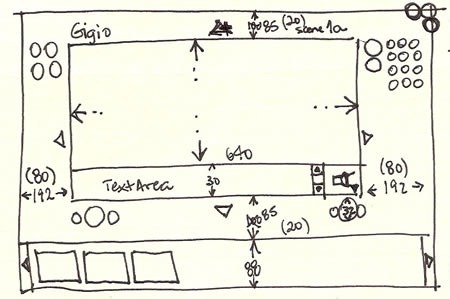
The Design Process The development world is limited to the IDE they most use (my friend in this project was in front of Visual Studio for the entire project). Designers have much more tools to work with. We can sketch on paper, we have several graphics tools like Photoshop, Fireworks, Expression Design, etc, and recently, a bunch of prototyping tools like Balsamiq, iRise, GUI Design Studio (this is the one I have used most) and, in a few months, Expression Blend with SketchFlow (more on that in the future postings). With the data that I had, plus the basic persona document I covered in the last posting, I started with my favorite tool: paper thumbnail sketching! This is the part of designing I love much. It is easy, free (in costs and responsibilities) and it clarifies any idea you have. Below you can see some of the thumbs I have used in different projects I have worked or will work a day when I win over laziness. I couldn’t find any thumb from this particular project but it is ok, as thumbs should be disposable. 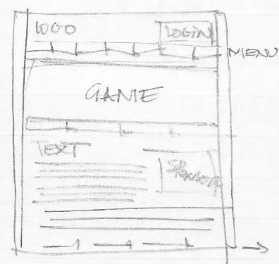
Basic pencil and paper, just to block interface spaces.
A few details, again in pencil and paper.
Another interface blocking example.
Several studies in pen and paper.
Working with measurements.
Another great advantage of thumbnails is the fact they are understandable by developers too. In this particular project, I used them to define the basics of the interface. With this info, the developer was able to start the design of the forms of the application (in this case the decision was to use Windows Forms instead of WPF due the fact most of our target customers are using some older machines), blocking interface spaces, being able to keep his focus on the image manipulation area, for example.
As mentioned before, our friend the dentist was not that “visionary” as the developer. Thumbnails and mockups (static image files) are good tools for designers and project members but, unfortunately, experience shows that they are not good enough for overall users. To them, the best way to show something is thru prototypes.
Prototypes can be seen in several forms (search Wikipedia for example and you will see several different types). In order to keep this post not enormous, I will mention only LOW, MEDIUM and HIGH definition types.
A low def prototype can be done using only paper or PowerPoint. You sketch the interface in a paper (or in a slide), draw some buttons placing them on top of the first sheet you drew the interface and start your tests. Low def prototypes are good for testing basic interactions (by the way, conventional things like Login, Go Back, etc don’t need to be prototyped as users are already familiar with that –of course this not applies if you are building a new kind of login) although many designers are questioning the efficacy of this method as many end users are not able to fully understand them. Also, with the number of tools we have today to simulate interactions (PowerPoint included), it is worthy to spend a few more hours and build a medium or high definition prototype.
Some people disagree with the idea of a medium def prototype. To them, anything more detailed than a low def version is a high-def by definition. To me, high definition prototypes should be done only in more advanced phases of your project (you will read my real example in a minute or two). The concept of medium definition I use is something that has interactivity with a known interface that allows the user to navigate without further instruction (although in most cases the interface graphics are far from the final).
When I had to show my concept to our dentist, I created a “medium” definition prototype using GUI Design. If you install the player they provide for free, you can see the first interaction I built (to see better, after open my project, right click and disable Annotation Tool Tips). You can also see the documentation file the product generates, which helps a lot the development process.
After seeing the prototype, our friend the dentist was convinced that some features were not making sense, like the idea of having a gallery with different pictures of the patient. According to him this process occurs only one time. This info was very interested and supported me in the decision to move the original patient data menu from the right to the bottom of the interface.
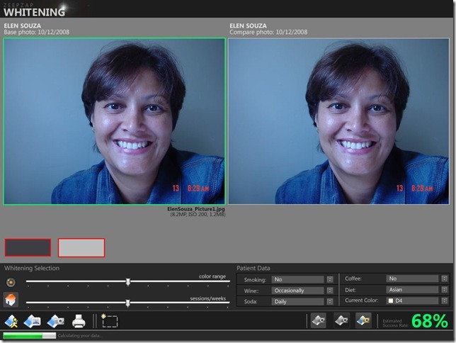
The next step was to build the first mockup of the interface, as you can see below.
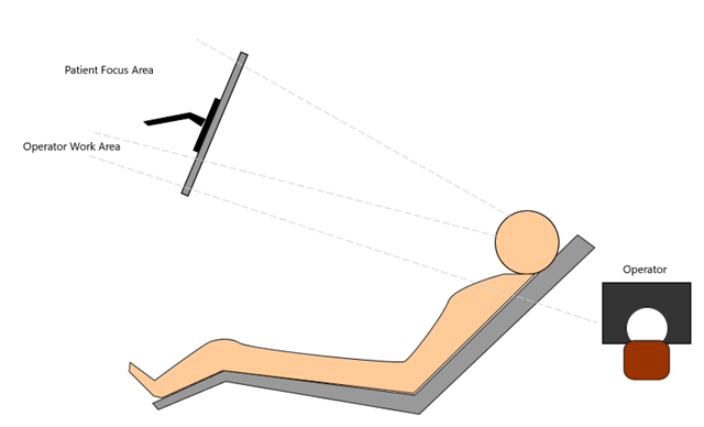
As you probably notice (the dentist did) the interface is totally different than the ones he was familiar with (almost all dentistry software have a Windows Form like interface). Being a designer, I explained him the decisions on the colors (gray is a neutral color that does not compete with the photo colors. If I had used white as background, patients would not be that impressed with the new white color in their teeth, for example), and the bottom position of the menu (my studies showed me that patients seat in the dentist chair look for a monitor positioned on top of their heads, making the top part of the interface the most important to them). Positioning the menu on the bottom (not the standard pattern) allowed the dentist to work freely with the menus without having to trail the mouse over the patient picture, which would cause a distraction to them. The way it was designed allows the patient to be focused only in their mouth).
A few reviews helped me to select the final color palette and menu positioning. With this mockup, the developer was ready to implement the code and build our first high-definition prototype.
The decision to make a high-definition prototype varies from each project. In our case, we decided to make it as our intention was to validate if this kind of software would have acceptance or not from potential customers. Basically, we would like to validate the concept with real dentists and collect their perceptions. Would they buy it? Our high def proto had only the main feature done (the teeth selection and the whitening results according to the Patient Data selection), optimized for a single photo. Also, in order to make things quickly, I used free icons available on the web to build the interface (to be honest, I am not a good illustrator and to draw icons for me is painful). With this prototype, we collected good feedback from our users and my friends decided to GO with their product. I did some tweaks in the interface, making it able for our first usability test. 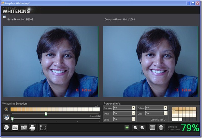
The results of the usability session were interesting, as several things we judged “cool” (remember the importance of having a good persona document and keep your development always thinking in her/his?) were considered distractions. Also, things that we thought were not that important appeared as a must have to the potential customers. Another round of improvements (now I had to draw every icon…) and the software was ready for the last usability test.
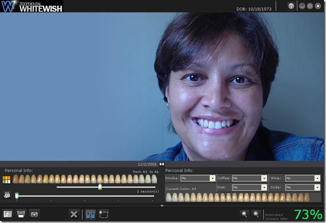
As you can see, the final interface was pretty close to the original mockups. 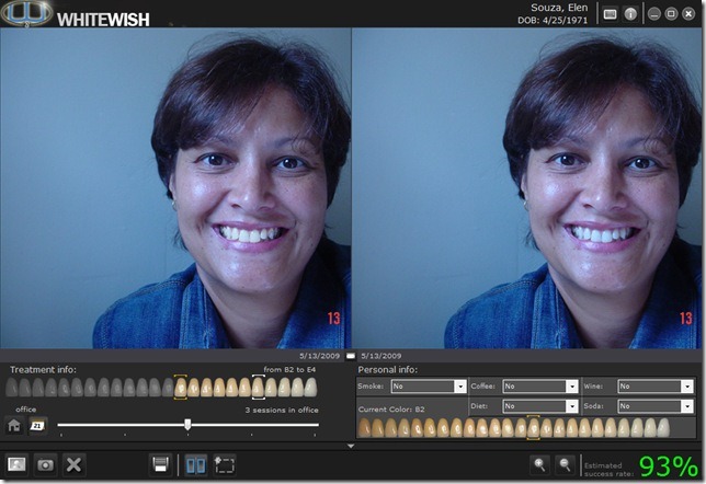
The total project time (from the first meeting to my last sent icon file) was around 3 months, which I think was a nice time considering my, and also my friend’s, part-time involvement, 1 medium, 1 high definition prototype, plus 2 usability sessions. Some learning includes:
- More time dedicated to your persona definition means less re-work in further development phases;
- Sketch as many thumbs as possible. They are like visual brainstorms (there are no right or wrong). Thumbs helped me to position the main menu in the bottom, making the interface very unique;
- Establish a formal way of model integration (define file names, shared folders, feature sheet, etc) before to start your project;
- Do NOT spend much time in Photoshop or Visual Studio (or whatever is your favorite graphics/IDE tool) in the initial phases of your project! Agree in features first, plan, mockup than prototype!
- Approach end users with high definition (or at least medium def) prototypes. Low fidelity prototypes are great for the development team only;
- Involve designers and developers since the begin. It would be very difficult to me to fix the interface flaw I mentioned early if the developer had locked by code all the elements of the UI.
I hope this posting have brought some good ideas and concepts to you. Let me know your comments!
